class: center, middle, inverse, title-slide # ICTC 3104.3 Data Analytics and Big Data ## Data Visualization ### 2020-09-10 --- # Outline 1. Basics of R Programming 2. Data Import 3. Data Wrangling 4. Data Visualization --- class: duke-green, center, middle # Data Visualization 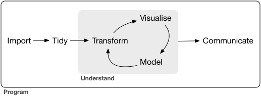 --- # Visualising Variables: Graphics ## Inclass - demo --- # Installing R Packages ## Method 1 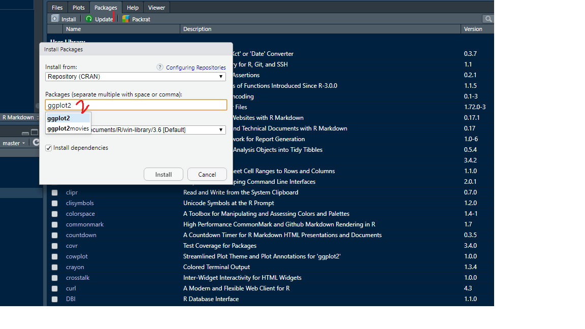 ## Method 2 ```r install.packages("ggplot2") ``` --- ## Load package ```r library(ggplot2) ``` Now search `?qplot` Note: You shouldn't have to re-install packages each time you open R. However, you do need to load the packages you want to use in that session via `library`. --- ## mozzie dataset ```r library(mozzie) data(mozzie) ``` We will use Rmarkdown to report the findings. --- ## Data Visualization with `qplot` ## plot vs qplot .pull-left[ ```r plot(mozzie$Colombo, mozzie$Gampaha) ``` 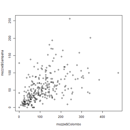<!-- --> ] .pull-right[ ```r qplot(Colombo, Gampaha, data=mozzie) ``` <!-- --> ] --- ## Data Visualization with `qplot` .pull-left[ ```r qplot(Colombo, Gampaha, data=mozzie) ``` <!-- --> ] .pull-right[ ```r qplot(Colombo, Gampaha, data=mozzie, colour=Year) ``` 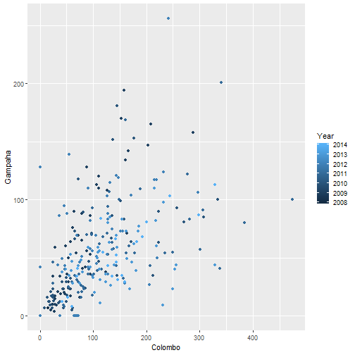<!-- --> ] --- ## Data Visualization with `qplot` .pull-left[ ```r qplot(Colombo, Gampaha, data=mozzie) ``` 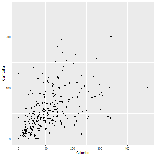<!-- --> ] .pull-right[ ```r qplot(Colombo, Gampaha, data=mozzie, size=Year) ``` 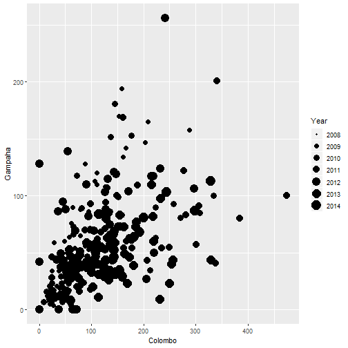<!-- --> ] --- ## Data Visualization with `qplot` .pull-left[ ```r qplot(Colombo, Gampaha, data=mozzie) ``` <!-- --> ] .pull-right[ ```r qplot(Colombo, Gampaha, data=mozzie, geom="point") ``` <!-- --> ] --- ## Data Visualization with `qplot` .pull-left[ ```r qplot(ID, Gampaha, data=mozzie) ``` <!-- --> ] .pull-right[ ```r qplot(ID, Gampaha, data=mozzie, geom="line") ``` 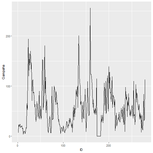<!-- --> ] --- ## Data Visualization with `qplot` .pull-left[ ```r qplot(ID, Gampaha, data=mozzie) ``` 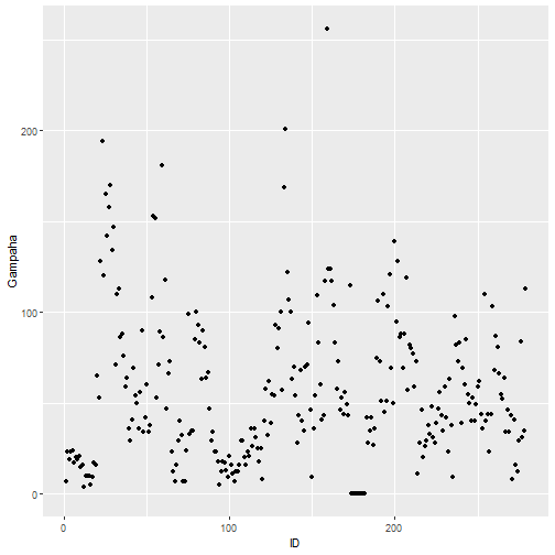<!-- --> ] .pull-right[ ```r qplot(ID, Gampaha, data=mozzie, geom="path") ``` <!-- --> ] --- ## Data Visualization with `qplot` .pull-left[ ```r qplot(Colombo, Gampaha, data=mozzie, geom="line") ``` 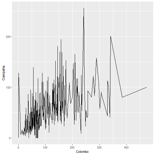<!-- --> ] .pull-right[ ```r qplot(Colombo, Gampaha, data=mozzie, geom="path") ``` 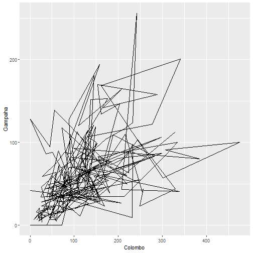<!-- --> ] --- ## Data Visualization with `qplot` .pull-left[ ```r qplot(Colombo, Gampaha, data=mozzie, geom=c("line", "point")) ``` 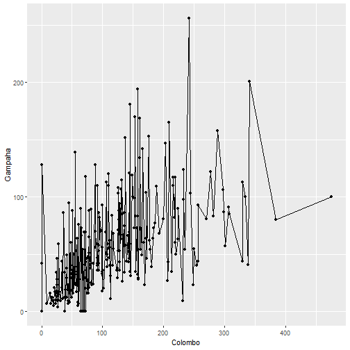<!-- --> ] .pull-right[ ```r qplot(Colombo, Gampaha, data=mozzie, geom=c("path", "point")) ``` 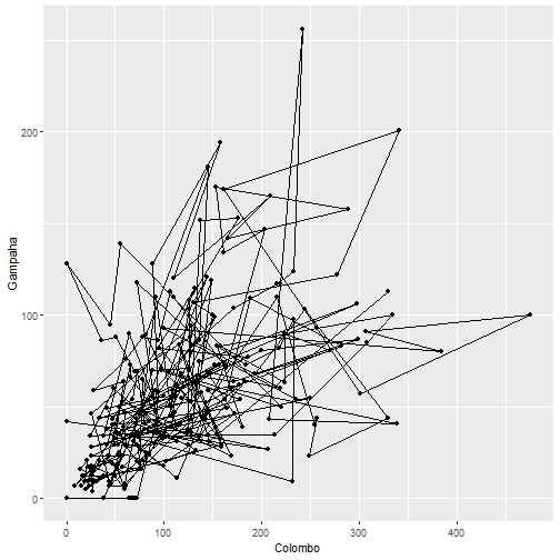<!-- --> ] --- ## Data Visualization with `qplot` .pull-left[ ```r boxplot(Colombo~Year, data=mozzie) ``` 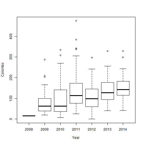<!-- --> ] .pull-right[ ```r qplot(factor(Year), Colombo, data=mozzie, geom="boxplot") ``` 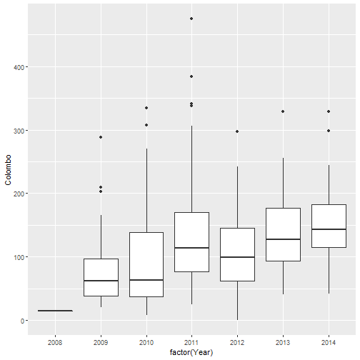<!-- --> ] --- ## Data Visualization with `qplot` .pull-left[ ```r qplot(factor(Year), Colombo, data=mozzie, geom="boxplot") ``` <!-- --> ] .pull-right[ ```r qplot(factor(Year), Colombo, data=mozzie) # geom="point"-default ``` <!-- --> ] --- ## Data Visualization with `qplot` .pull-left[ ```r qplot(factor(Year), Colombo, data=mozzie, geom="point") ``` 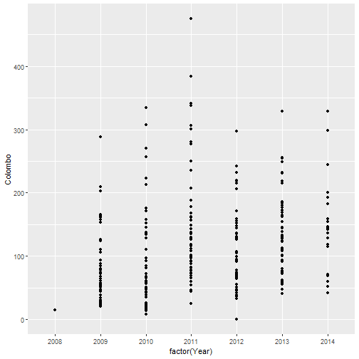<!-- --> ] .pull-right[ ```r qplot(factor(Year), Colombo, data=mozzie, geom=c("jitter", "point")) # geom="point"-default ``` 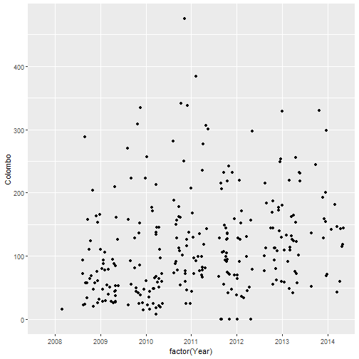<!-- --> ] --- ## Data Visualization with `qplot` .pull-left[ ```r qplot(factor(Year), Colombo, data=mozzie, geom=c("jitter", "point")) ``` 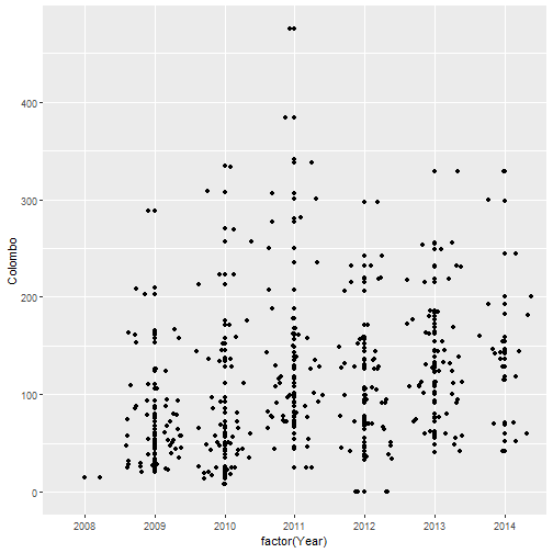<!-- --> ] .pull-right[ ```r qplot(factor(Year), Colombo, data=mozzie, geom=c("jitter", "point", "boxplot")) # geom="point"-default ``` 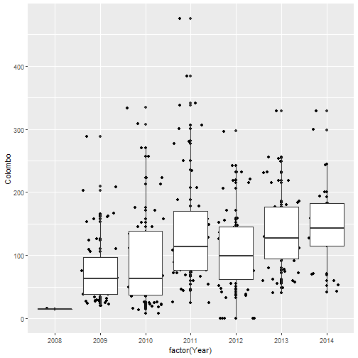<!-- --> ] --- ## Data Visualization with `qplot` .pull-left[ ```r qplot(Colombo, data=mozzie) ``` ``` `stat_bin()` using `bins = 30`. Pick better value with `binwidth`. ``` 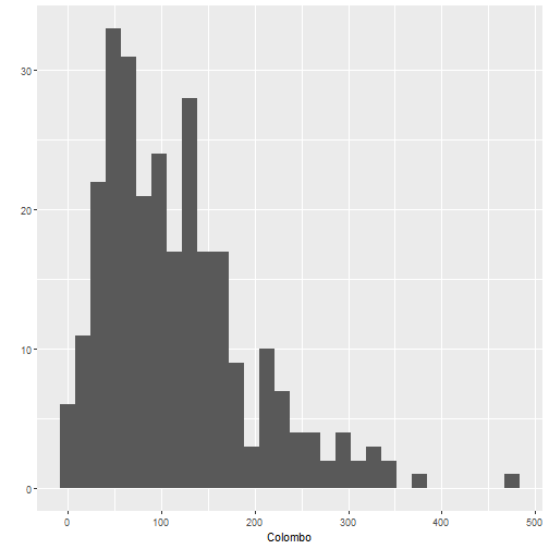<!-- --> ] .pull-right[ ```r qplot(Colombo, data=mozzie, geom="density") ``` 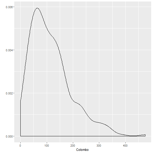<!-- --> ] --- # geom arguments in qplot - `point`: scatterplots. - `line`: line plot - `histogram`: histogram - `boxplot`: boxplot - `density`: density plot - `bar`: barplot - `smooth`: fits a smooth line --- # Inputs - data: Specify the dataframe that all variables belong to - main: add a title - xlab, ylab: add x and y axis labels - color: Controls the color of the lines/points - fill: Controls the color of areas (e.g. for histograms, boxplots) - size: Controls the size of points - shape: The shape of points ("circle", "square", "triangle", etc. . . ) - alpha: Controls the level of transparency of points/lines/fills - lwd: Controls line width - lty: Line type ("solid", "dashed", "dotted", etc. . . ) - facets: Split up the data into multiple plots --- # Facetting ```r df <- data.frame(gender=rep(c("Male", "Female"), each=5), income = c("high", "high", "high", "low", "middle", "middle", "middle", "low", "low", "high")) qplot(data=df, geom="bar", income)+facet_grid(~gender) ``` <!-- --> --- # Change the order ```r df$income <- factor(df$income, levels = c("high", "middle", "low")) qplot(data=df, geom="bar", income)+facet_grid(~gender) ``` <!-- --> --- # Add y-axis ```r df$income <- factor(df$income, levels = c("high", "middle", "low")) qplot(data=df, geom="bar", income)+facet_grid(~gender) + ylab("Count") ``` <!-- --> --- # Percentages in y-axis ```r library(magrittr) library(tidyverse) df2 <- df %>% group_by(gender, income) %>% summarise(count=n()) %>% mutate(percentage=count/sum(count)*100) df2 ``` ``` # A tibble: 6 x 4 # Groups: gender [2] gender income count percentage <chr> <fct> <int> <dbl> 1 Female high 1 20 2 Female middle 2 40 3 Female low 2 40 4 Male high 3 60 5 Male middle 1 20 6 Male low 1 20 ``` --- # Plot percentages ```r ggplot(df2, aes(x = income, y = percentage)) + geom_bar(stat="identity", width = 0.7) + facet_grid(~gender) + labs(x = "Groupchange", y = "percent", fill = "Symscore") ``` <!-- --> --- # Stack bar chart ```r qplot(x=gender, data=df)+geom_bar(aes(fill = income)) ``` <!-- --> Hard to compare across when you have more than two categories. --- class: duke-orange, center, middle # Your turn - Individual Assignment 1  --- # Data ```r facebookdata_marketing <- readRDS("~/Lecturer/1_TEACHING/2020_s1/Rprogramming/static/slides/facebookdata_marketing.rds") head(facebookdata_marketing) ``` ``` # A tibble: 6 x 11 month category hour paid totalReach engagedUsers postConsumers <fct> <fct> <dbl> <fct> <dbl> <dbl> <dbl> 1 12 2 3 0 2752 178 109 2 12 2 10 0 10460 1457 1361 3 12 3 3 0 2413 177 113 4 12 3 10 1 50128 2211 790 5 12 2 3 0 7244 671 410 6 12 2 9 0 10472 1191 1073 # … with 4 more variables: postConsumptions <dbl>, sawbyLiked <dbl>, # clickbyLiked <dbl>, totalInteractions <dbl> ``` ```r dim(facebookdata_marketing) ``` ``` [1] 500 11 ``` A manager of a retail company wants to identify the factors associated with total number of likes, comments, and shares on facebook posts. Perform a suitable exploratory data analysis. --- ## Variable description - **month:** Month the post was published (1, 2, 3, ..., 12) - **category:** Type of the post (1 - Link, 2 - Video, 3 - Picture) - **hour:** Hour the post was published (0, 1, ...24) - **paid:** If the company paid to Facebook for advertising (0 - No, 1 - Yes) - **totalReach:** Number of people who saw the page post (unique users). - **engagedUsers:** Number of people who clicked anywhere in the post (unique users). - **postConsumers:** Number of people who sent a direct message to the owner of the post. - **postConsumption:** Number of clicks anywhere in the post. - **sawbyLiked:** Number of people who saw the page post because they have liked that page. - **clickbyLiked:** Number of people who have liked the Page and clicked anywhere in the post. - **totalInteractions:** The sum of “likes,” “comments,” and “shares” of the post --- class: center, middle All rights reserved by [Dr Thiyanga S. Talagala](https://thiyanga.netlify.app/)